Charts and Graphs
Charts and Graphs
Your child will need to recognise and understand different ways of displaying data using charts and graphs.
Bar charts, line graphs, pictograms and pie charts all show data in a visual way.
Bar Charts
Bar charts make things easy to compare.
The \bf{x}-axis goes along the bottom and has different labels for each bar.
The \bf{y}-axis goes up the side and usually shows frequency (how many).
Example: Andrew did a survey on the colour of cars in a carpark. The results are shown in the bar chart below.
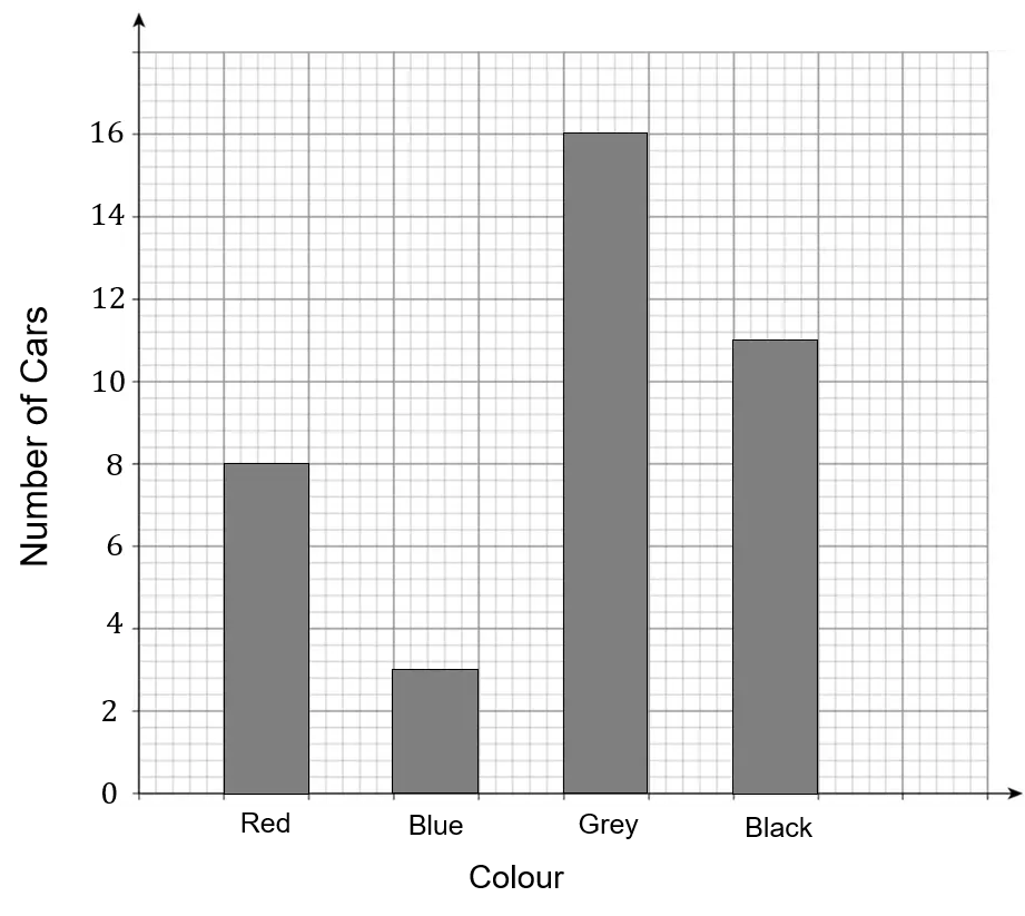

The height of each bar tells us how many cars there were of each colour.
We read across from the top of the bar to the number on the axis.
So there were 8 red cars, 3 blue cars, 16 grey cars and 11 black cars.
Line Graphs
Line graphs show how two things change in relation to each other, for example how temperature changes over time, or how weight changes with height.
The \bf{x}-axis goes along the bottom and often shows time.
The \bf{y}-axis goes up the side and shows something else that is changing.
Example: This graph shows George’s distance from home during the day.
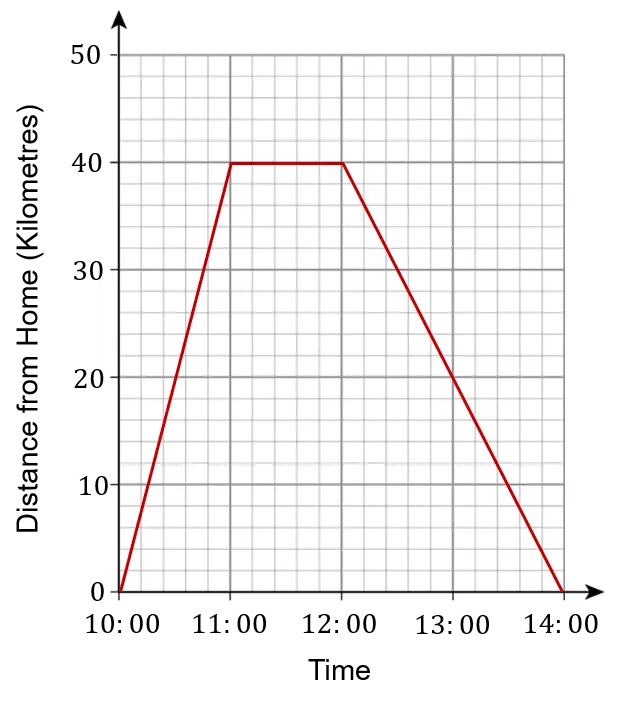

Between 10:00 and 11:00 the graph is sloping upwards, so George is getting further away from home.
Between 11:00 and 12:00 the graph is flat, so George’s distance from home isn’t changing. He has stopped somewhere.
Between 12:00 and 14:00 the graph is sloping downwards, so George is getting closer to home again. He arrives back home at 14:00.
Example \bf{1}: Reading a Value from a Line Graph
Looking again at the line graph of George’s journey, what is his distance from home at 13:00?
We need to find 13:00 along the bottom, and draw a line straight up to where it meets the graph. We then draw a line from there straight across to the y-axis and read off the value for the distance.
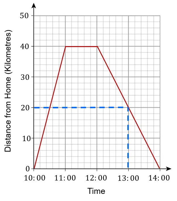
So we can see that at 13:00 George was 20\text{ km} from home.
Pictograms
Pictograms use pictures or symbols to show how often something happens.
The key tells us how many things each picture represents.
Example: Sarah is a keen reader. This pictogram shows how many books Sarah read at the start of the year:

The key tells us that a whole circle represents 4 books. Therefore half a circle must represent 2 books, a quarter circle must represent 1 book, and three quarters of a circle must represent 3 books.
So in January Sarah read 4+4+2=\bf{10} books, in February she read 4+1=\bf{5} books, and so on.
Example \bf{2}: interpreting pictograms
Brenda recorded how many customers she had in her shop each day last week. The results are shown in the pictogram.
How many customers did she have in total over the week?
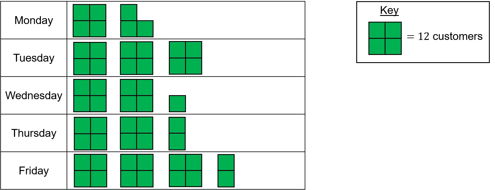
First make sure your child understands the key:
We know a block of 4 small squares represents 12 customers, so two small squares must represent 6 customers, one small square must represent 3 customers, and three small squares must represent 9 customers.
We can now find how many customers there were each day:
Monday: 12+9=21
Tuesday: 12+12+12=36
Wednesday: 12+12+3=27
Thursday: 12+12+6=30
Friday: 12+12+12+6=42
Finally, we can find how many customers there were in total during the week by adding the numbers for each day: 21+36+27+30+42=\bf{156} customers
Pie Charts
Pie charts show things as proportions. This means means the fraction of the total amount.
Example: A group of children played a game. They could win one point, two points or three points. The pie chart below shows the results:
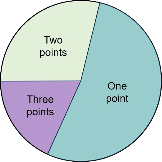

We can see that the biggest sector is for one point, so that means most of the children only scored one point.
The next biggest sector is for two points, so fewer children scored two points.
And the smallest sector is for three points, so the fewest number of children scored three points.
Example \bf{3}: Finding Values from a Pie Chart
Your child may need to work out the number of things represented by each section, or sector, on a pie chart.
The pie chart below shows the results of a survey asking 60 children their favourite flavour of crisps. Work out how many children chose each flavour.
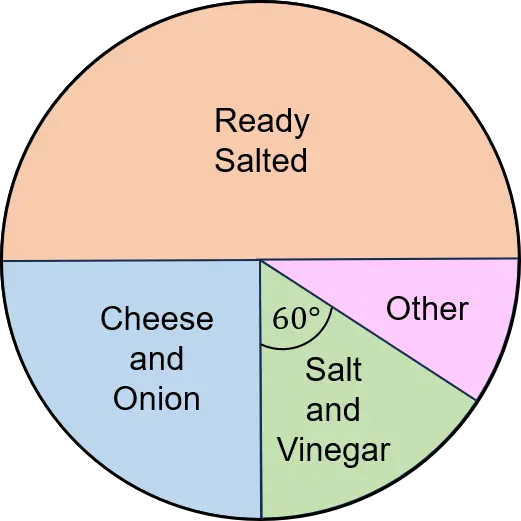
We can see that ready salted takes up half the pie chart. Half of the 60 children is 30, so \bf{30} children chose ready salted.
Cheese and onion takes up a quarter of the pie chart. A quarter of the 60 children is 60\div4=15, so \bf{15} children chose cheese and onion.
Salt and vinegar and other are more tricky!
Remind your child that the whole pie chart is \bf{360°}, because angles around a point add to 360°.
So the fraction of the pie chart represented by salt and vinegar is \dfrac{60}{360}, which simplifies to \dfrac{1}{6}.
So \bf{\dfrac{1}{6}} of \bf{60=60\div6=10} children chose salt and vinegar.
We are not told the angle for other. But we know that salt and vinegar and other add together to make a right angle, or 90°. Therefore the angle for other must be 90-60=30°
So the fraction of the pie chart represented by other is \dfrac{30}{360}, which simplifies to \dfrac{1}{12}.
So \bf{\dfrac{1}{12}} of \bf{60=60\div12=5} children chose other flavours.
An alternative way to find the final value would be to say that we know there are 60 children in total, and we have already accounted for \bf{30}, \bf{15} and \bf{10}, so we must have \bf{5} left to make up the total of 60.
Charts and Graphs Example Questions
Question 1: Philip asked the children in his year group what type of pets they owned. The results are shown in the bar chart.
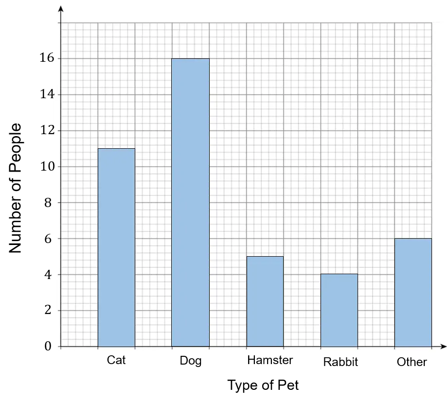
How many children did Philip ask in total?
[2 marks]
We need to add up the total for all of the bars.
Cat: 11
Dog: 16
Hamster: 5
Rabbit: 4
Other: 6
Total =11+16+5+4+6=42 children
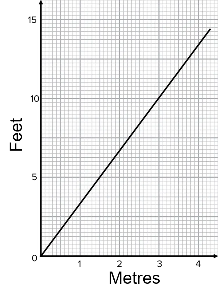
Question 2: Steve needs 10 feet of fencing for his garden.
The hardware shop he goes to sells fence panels in one metre lengths. They cost £20 per panel.
Using the line graph, work out how much it will cost Steve to buy the fencing.
[2 marks]
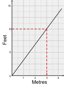
Reading across from 10 feet and down, we can see that 10 feet is 3 metres.
3 metres of fencing will cost 3\times£20=£60
Question 3: A weather station measured the hours of sunshine per week for 4 weeks.
This information is shown in the pictogram.

What was the difference between the number of hours of sunshine in week 1 and in week 4?
[2 marks]
A full sun symbol represents 8 hours, so half a sun is 4 hours, a quarter of a sun is 2 hours and three quarters of a sun is 6 hours.
In week 1 there were 8+8+4=20 hours.
In week 4 there were 8+6=14 hours.
So the difference is 20-14=6 hours.
Question 4: The types of tree in a park are recorded and the information is shown in this pie chart:
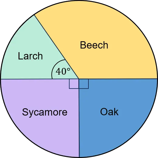
a) What is the angle for the ‘beech’ sector?
b) 30 trees were larch. How many trees were there in the park in total?
a) We know that beech and larch make up half the pie chart, so must add up to 180°.
So beech must be 180-40=140°
b) We are told that 40°=30 trees
We need 360\div40=9 lots of this to make the full pie chart.
So there must be 30\times9=270 trees in the park.

